Color schemes
Many people are terrified when it comes to choosing colors for their website. The vast selection of colors can be overwhelming - but it doesn't need to be. You make color selections every day - from what you wear to the color of rooms in your home.
People have an emotional response to color so you want to pick ones that will complement your website's content. For example you should use bright, saturated colors for a children's page.
Reds: energy, passion, danger
Blues: calmness, tranquility, stability
Greens: growth, nature, freshness
Yellows: happiness, playfulness, sunshine
Browns: stability, earthy
Blacks: solomness, mystery, power
Basic color schemes
 Monochromatic color scheme
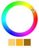
The monochromatic color scheme uses a primary color to create an overall mood. Tints and shades of the primary color are used to enhance the scheme. This scheme is easy to balance and is soothing to look at. It can be used with neutral colors like black, white or grey.
 Analogous color scheme
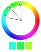
The analogous color scheme uses adjacent colors on the color wheel. The primary color is dominant while the others are used as highlights. The analogous color scheme is similar to the monochromatic scheme but offers a more vibrant look.
 Complementary color scheme
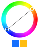
The complementary color scheme uses colors that are directly opposite each other on the color wheel. This color scheme creates a high-contrast effect. It is best to use one color as the dominant color and the second color as an accent in your design. This technique will allow you to highlight important information and make it jump out at your readers.


